 Technical Performance Optimization: Improving the Mobile Speed of Cross-Border Independent Websites
Mobile speed determines user retention. According to Google research, an increase in page load time from 1 to 5 seconds increases bounce rates by 90%, directly impacting conversion opportunities.
Build a Lightning-Responsive Mobile Experience
-
Image Optimization and Visual Resource Management: Implement automated image optimization and compression workflows; adopt next-generation image formats (WebP, AVIF) to reduce file size; implement responsive images and appropriately sized resources; configure lazy loading to prioritize visible content; streamline product page images, balancing the number and quality of images; optimize thumbnail strategies and gallery performance; and pay special attention to image strategy on mobile networks. A key strategy is "Critical Rendering Path Optimization," which ensures that above-the-fold content displays as quickly as possible. Research shows that this approach can reduce perceived load times by approximately 57% and significantly improve user retention.
-
Code Minification and Resource Optimization: Implement CSS/JavaScript code splitting and on-demand loading; remove unnecessary libraries and redundant code; optimize the order in which third-party scripts are loaded and executed; implement effective browser caching strategies; consider mobile-specific code optimization and simplification; inline CSS critical paths to accelerate first-page render; and pay special attention to the impact of JavaScript execution on mobile CPUs. A highly effective approach is "Core Web Metrics Optimization," focusing on improving three key metrics: LCP, FID, and CLS. Research shows that this targeted optimization can improve user experience scores by approximately 45% and boost search rankings.
-
Server Response and Global Acceleration: Optimize server response time and backend processing efficiency; implement a content delivery network (CDN) to reduce global access latency; consider edge computing and static site generation speedups; optimize API call and data transmission efficiency; implement resource preloading and preconnection of key domains; consider mobile-specific acceleration and optimization services; and pay special attention to strategies that adapt to mobile network quality in different regions. Research shows that a comprehensive server optimization strategy can reduce total page load time by an average of approximately 35%, while effective CDN deployment can increase global user access speeds by approximately 60%, making it particularly crucial for cross-border businesses.
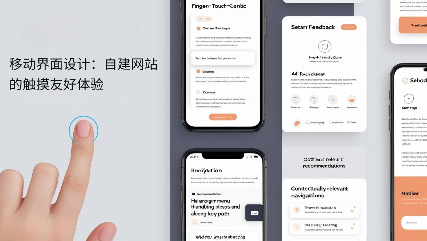 Mobile Interface Design: Touch-Friendly Experience for Self-Built Websites
The mobile interface determines ease of use. According to research by the Nielsen Norman Group, touch-friendly design can increase mobile task completion rates by up to 43%, directly impacting conversion paths.
Designing a finger-centric interactive experience
-
Touch-optimized and interactive design: Ensure all interactive elements meet touch size standards (minimum 44×44 pixels); optimize element spacing to prevent accidental touches and operational frustration; implement precise click zones larger than visible buttons; design clear touch feedback and status indicators; optimize layouts based on how the phone is held and the thumb zone; implement gesture navigation and intuitive operation modes; and pay special attention to interaction adaptation for different screen sizes. A key strategy is "thumb zone optimization," placing key functions in an area that is easily accessible with one hand. Research shows that this design can increase mobile operation efficiency by approximately 31% and reduce user abandonment rates.
-
Navigation Simplification and Information Architecture: Implement a streamlined, mobile-specific navigation structure; create an intuitive hamburger menu and hierarchical category system; optimize search functionality for mobile input characteristics; design a clear visual hierarchy and focus guidance; consider smooth connections and reduced steps in key user paths; implement contextually relevant recommendations and navigation aids; and pay special attention to cross-page consistency and expected experience. Research shows that navigation structures designed specifically for mobile improve task completion rates by an average of approximately 47% compared to simple, responsive navigation, while also reducing user loss and frustration.
-
Form Design and Data Entry Optimization: Simplify mobile forms, retaining only essential fields; implement appropriate input types and keyboard optimization; create step-by-step forms and segmented data collection; design intelligent default values and auto-fill support; consider alternative input methods (select alternative input, scanning, etc.); implement instant validation and clear error guidance; and pay special attention to the differences in input habits and needs of international users. One highly effective strategy is "progressive forms," which break down complex data collection into simple steps. Research shows this approach can increase mobile form completion rates by approximately 38%, while also improving data quality and user satisfaction.
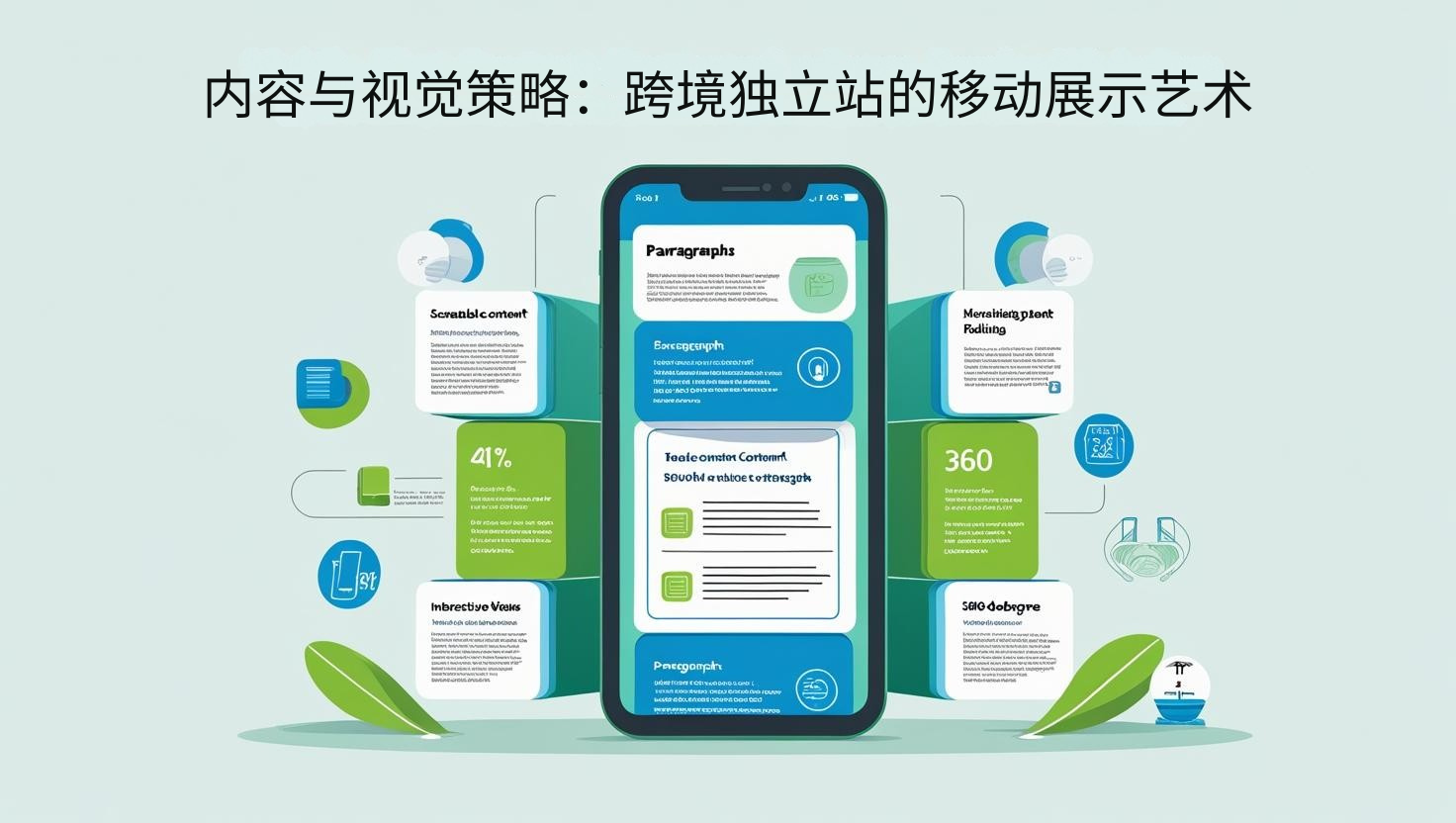 Content and Visual Strategy: The Art of Mobile Presentation for Cross-Border Independent Websites
Mobile content strategy determines the effectiveness of your message. According to research by the Content Marketing Institute, mobile-optimized content generates an average of 56% higher engagement and 34% higher conversion rates than generic content.
Creating a Mobile-First Content Experience
-
Mobile Content Conciseness and Hierarchical Design: Implement a mobile-first content strategy and streamlined narrative; create scan-friendly paragraph structures and information blocks; design progressive content disclosure and demand-driven presentation; optimize heading systems and emphasis levels; consider prioritizing key information and content; implement interactive content folding and expansion mechanisms; and pay special attention to content adaptability for different screen sizes. A highly effective strategy is a "layered content architecture," which presents information in layers based on importance and detail. Research shows that this approach can increase mobile content consumption completeness by approximately 41% while also improving the effectiveness of key information delivery.
-
Optimize Product Display and Visual Storytelling: Create a mobile-optimized product display strategy and visual hierarchy; design effective mobile galleries and product detail displays; optimize product information architecture and specification presentation; consider interactive product exploration and 360-degree views; implement contextually relevant product recommendations and related displays; design mobile-friendly video experiences and multimedia content; and focus on prominently displaying key product decision-making information. Research shows that mobile-optimized product pages increase product exploration depth and add-to-cart rates by an average of 29% and 23% compared to standard responsive pages, demonstrating the value of mobile-specific product display.
-
Optimize Call-to-Action and Conversion Points: Implement an "always visible" primary call-to-action strategy; create a clear and prominent visual hierarchy and attention-grabbing approach; optimize button size, color, and text for mobile visibility; consider scroll-aware dynamic CTA placement; design contextually relevant secondary conversion options; implement one-click add-to-cart and accelerated checkout paths; and pay special attention to friction points and decision aids along the conversion path. A key strategy is "intent-aware CTAs," which dynamically adjust the call to action based on user behavior and page location. Research shows that this intelligent approach can increase mobile conversion click-through rates by approximately 34%, significantly improving conversion path efficiency.
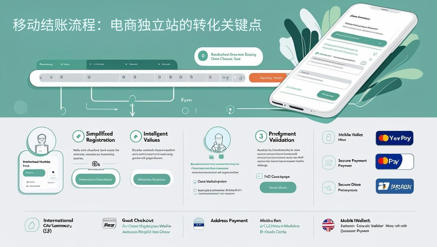 Mobile Checkout Process: Key Conversion Points for E-commerce Independent Sites
The checkout process determines purchase completion rates. According to research by the Baymard Institute, an optimized mobile checkout process can reduce abandonment rates from an average of 85.65% to approximately 53%, directly increasing revenue.
Design a Frictionless Mobile Purchase Experience
-
Streamlined Checkout and Path to Purchase Optimization: Implement a mobile-specific streamlined checkout process and reduce steps; create a single-page checkout and a progress save mechanism; optimize the number of form fields and the appropriateness of required fields; design intelligent default values and pre-populate contextual information; consider simplified registration and guest checkout options; implement address validation and input assistance features; and pay special attention to the unique checkout needs and adaptations for international users. One effective strategy is "micro-conversion design," which breaks down the checkout process into a series of small steps and celebrates each step's completion. Research shows that this psychological approach can increase mobile checkout completion rates by approximately 27% and significantly reduce abandonment rates.
-
Mobile Payment Optimization and Localization: Implement mobile-specific payment method optimization and display; integrate mobile wallets and one-click payment options; design fingerprint/facial recognition payment authorization processes; consider region-specific preferred payment methods for prominence; optimize payment forms and credit card entry experiences; implement payment security indicators and trustmarks; and pay special attention to differences in payment preferences and habits in international markets. Research shows that websites offering localized preferred mobile payment methods increase checkout completion rates by an average of approximately 33% compared to offering only generic options, which is particularly critical in cross-border e-commerce.
-
Shopping Cart Optimization and Conversion Guarantee: Create a persistently visible shopping cart summary and transparent fee display; design mobile-friendly product editing and quantity adjustments; implement real-time inventory and shipping information updates; consider abandonment recovery strategies and save-cart functionality; optimize promotional code application and discount visibility; design clear purchase guarantees and policy communication; and pay special attention to the contextual needs and accessibility features of mobile shopping decisions. A key strategy is "transparent total cost design," which displays the full cost early in the shopping process. Research shows that this honest approach can increase final checkout conversion rates by approximately 19%. While it may slightly reduce initial add-to-cart rates, it significantly improves overall completion rates.
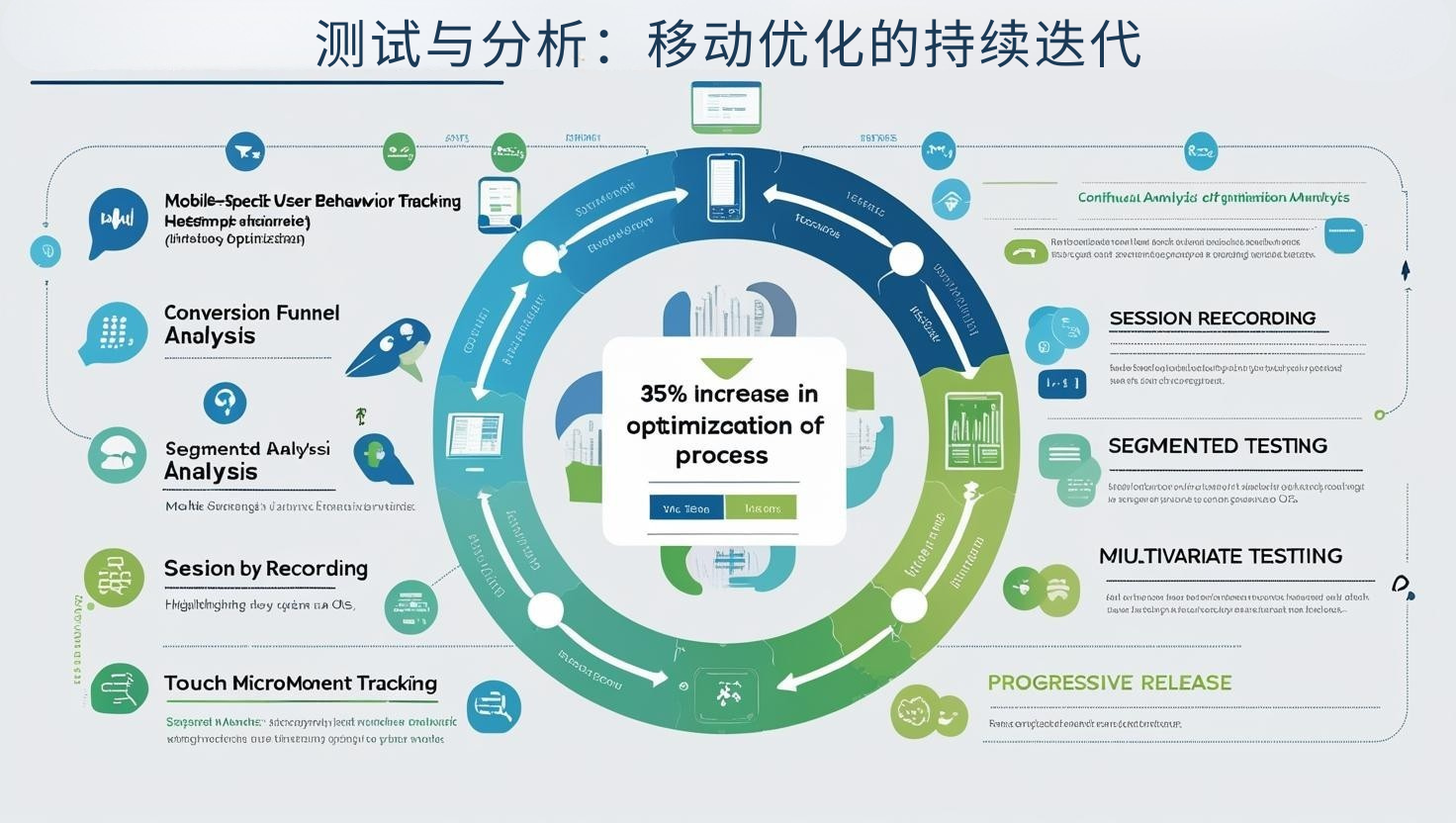 Testing and Analysis: Continuous Iteration of Mobile Optimization
Continuous testing determines long-term results. According to Optimizely research, websites that systematically test mobile apps achieve an average 38% higher conversion rate than those that use intuitive optimization.
Building a Data-Driven Mobile Optimization System
-
Mobile-Specific Analysis and Behavior Understanding: Implement mobile-specific user behavior tracking and heatmap analysis; create mobile user journey maps and conversion funnel visualizations; analyze mobile-specific usage patterns and identify pain points; consider segmented analysis based on device characteristics and operating systems; design in-depth tracking of touch behavior and gesture interactions; implement mobile session recording and user path reconstruction; and pay special attention to the influencing factors of different mobile scenarios and usage environments. A leading approach is "mobile micro-moment analysis," which identifies specific behavioral patterns at key decision points. Research shows that this granular analysis can uncover approximately 35% of optimization opportunities missed by traditional analysis.
-
Mobile A/B Testing and Experimentation Framework: Design a mobile-specific experimentation framework and test priorities; create a balanced test matrix for speed, design, and functionality; consider the balance between small incremental improvements and bold innovations; implement segmented testing and targeted optimization experiments; design multivariate tests to identify optimal combinations; consider feature flags and progressive release strategies; and pay special attention to differentiated testing and results analysis for international user groups. Research shows that companies that implement systematic mobile testing achieve an average 47% higher mobile conversion growth than their competitors who only test sporadically, demonstrating the critical value of continuous experimentation.
-
Technology Tracking and Identifying New Opportunities: Continue to track mobile technology developments and emerging interaction models; evaluate the value of implementing Progressive Web Apps (PWAs) and app-like experiences; consider opportunities for integrating voice search and voice navigation; research the mobile landscape of AR/VR product experiences; monitor the impact of 5G technology on mobile experience design; evaluate mobile implementation strategies for AI-driven personalization; and pay special attention to the evolution of mobile user expectations and cutting-edge use cases. One forward-thinking strategy is a "technology pilot framework," which tests emerging technologies in a controlled environment. Research shows that this approach can reduce implementation risk by approximately 63% while maintaining innovation leadership.
With mobile traffic continuing to dominate, systematic mobile optimization has become a key strategy for cross-border e-commerce success. Through comprehensive technical performance optimization, touch-centric interface design, mobile-specific content strategies, streamlined and efficient checkout processes, and data-driven continuous testing, companies can significantly increase mobile conversion rates, reduce abandonment rates, and enhance customer satisfaction and loyalty. The key lies in going beyond simple responsive design and adopting a true "mobile-first" mindset, reimagining every interaction based on user needs and behaviors.
Related article recommendations: https://pinshop.cn/zh-Hans/blog/what-is-independent-site-for-business