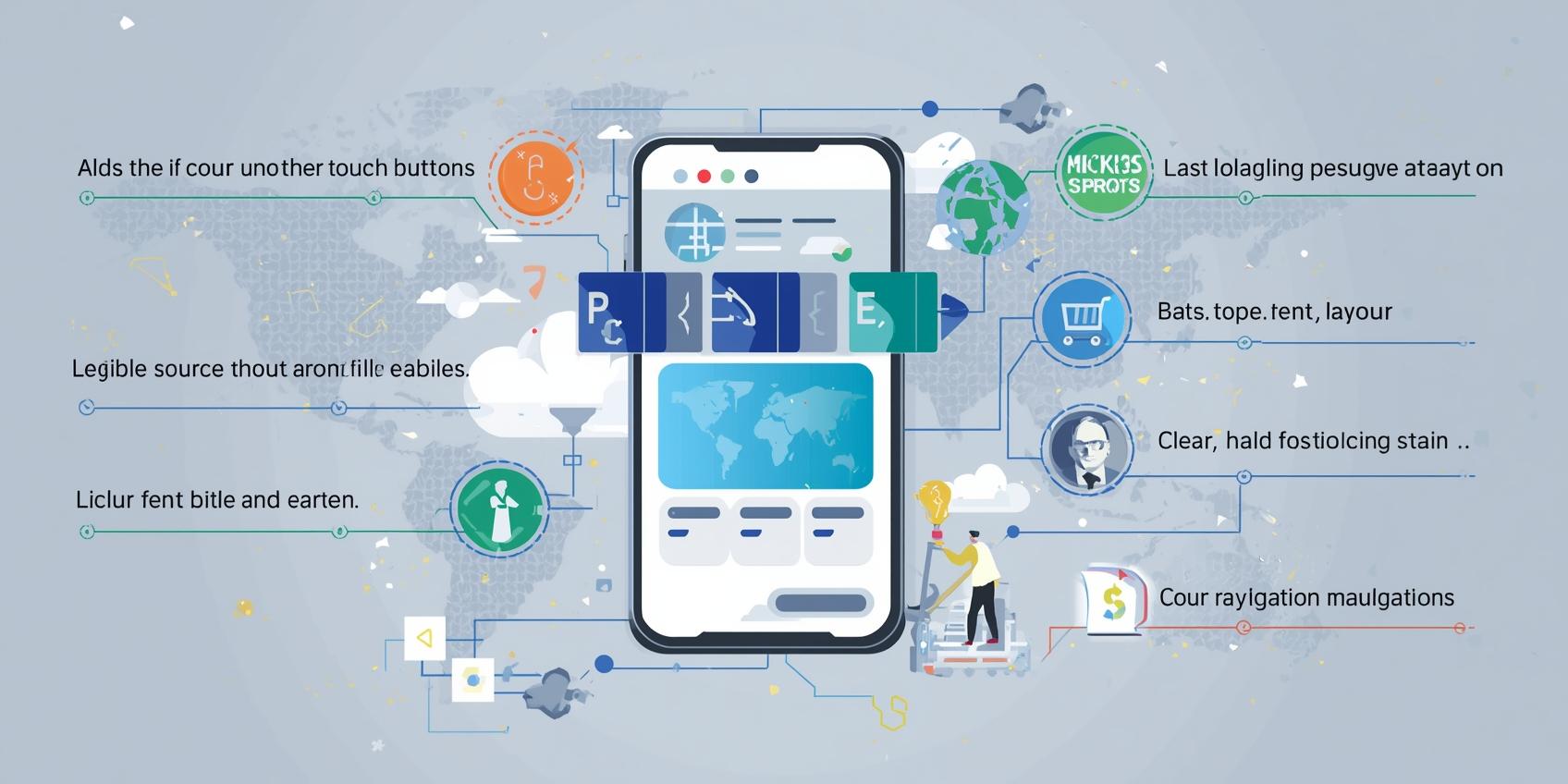
I. Layout Adaptation and Mesh System
In international trade website building, layout adaptation is the core of achieving responsive design. Data from the International Trade Centre (ITC) shows that using a fluid grid and flexible layout ensures a clear visual hierarchy across different screen sizes. Businesses should use adaptive grid systems on their homepage, product pages, and checkout pages to ensure that content elements are not misaligned or truncated due to changes in screen size.
II. Mobile Optimization Strategies
With the continued growth in the proportion of mobile device users, mobile experience directly impacts conversion rates. CECA points out that optimizing touch buttons, font size, and navigation structure can significantly improve user convenience. Foreign trade website developers should ensure their websites load quickly on mobile phones and tablets, have a logical layout, and that key operations such as adding items to the cart and placing orders are clearly displayed.
III. Image and Multimedia Processing
Images and multimedia content are crucial visual elements for e-commerce websites, but they can also impact loading speed. ISC research shows that unoptimized images increase page size, thus degrading the user experience. Businesses should use WebP or compressed formats, combined with lazy loading techniques, to achieve multi-device compatibility and efficient display, improving visual appeal while maintaining speed.
IV. Interaction Design and Touch Experience
Responsive design is not just about visual adaptation, but also about user experience. GEA research shows that button sizes, swipe gestures, and form input feedback optimized for touchscreen devices can enhance user comfort and conversion rates. Foreign trade website platforms should provide clear prompts and immediate feedback at key interactive points to increase user trust.
V. Multi-device testing and continuous optimization
Finally, multi-device testing is an essential part of responsive design. Businesses should conduct end-to-end testing on PCs, mobile phones, tablets, and different operating systems to identify and fix display and operational issues. Through continuous optimization and data monitoring, ensure that your foreign trade website provides a consistent and efficient access experience globally.
By applying these five best practices of responsive design, businesses building websites for international trade can comprehensively improve the user experience across multiple devices, thereby increasing customer dwell time and conversion rates. Use the Pinshop website building platform now to easily build a high-performing cross-border e-commerce website that works on both PC and mobile devices, achieving global sales growth.


