With the increasing popularity of smartphones, mobile users have become a significant demographic for independent websites. According to Statista, global mobile e-commerce visits will account for over 65% of total visits by 2024. This means that businesses that neglect the mobile experience will miss out on a significant number of potential customers.
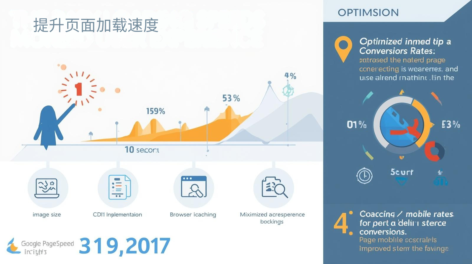 Improve page loading speed
Mobile users have limited patience, and page load times exceeding three seconds often lead to significantly increased bounce rates. Independent websites should optimize image size, use a content delivery network (CDN), enable browser caching, and minimize JavaScript blocking rendering. Google PageSpeed Insights ( Google ) emphasizes that page speed directly impacts user experience and search rankings, making optimizing speed a top priority for mobile conversions.
Responsive layout and visual design
Independent websites should adopt a responsive layout on mobile devices, ensuring that content displays adaptively across different screen sizes. Simple navigation, touchable buttons, and legible text are core principles of mobile design. The W3C (World Wide Web Consortium) recommends that responsive design not only improves user experience but also facilitates search engine crawling and aids SEO optimization.
 Touch operation optimization
Mobile users primarily interact via touchscreens. Therefore, form input fields, buttons, and drop-down menus should have ample clickable areas to minimize accidental touches. Jakob Nielsen ( NNG ) notes that optimizing the touch experience can significantly reduce the failure rate and increase the likelihood of users completing key actions (such as submitting a form or placing an order).
Simplify content structure and highlight key points
Mobile screens are limited, so independent website content should be concise and clear, highlighting the core information. Use block layouts, clear headlines, and call-to-action buttons to guide users to quickly obtain value. Simplifying the information hierarchy not only reduces cognitive load but also improves conversion rates.
Mobile-exclusive features
Companies can provide adaptive functions for mobile users, such as one-click dialing, one-click adding to shopping cart, gesture sliding to switch pictures, etc. These functions can improve user operation efficiency and interactive experience, and enhance the convenience of using the independent station mobile terminal.
Data-driven continuous optimization
Mobile optimization for independent websites requires continuous iteration. By analyzing user behavior data collected through tools like Google Analytics and Hotjar, and assessing page dwell time, click hotspots, and conversion funnels, companies can accurately identify problem areas and optimize the user experience. International Data Corporation ( IDC ) also emphasizes that data-driven optimization strategies are key to improving mobile conversion rates.
Mobile optimization not only impacts user experience but also directly impacts the conversion rate and brand image of your independent website. By scientifically optimizing page loading, responsive layout, touch operations, and content structure, companies can effectively improve user retention and submission willingness.
The Pinshop website building platform offers mobile-first standalone website optimization features, including intelligent responsive design, touch interaction optimization, and page loading acceleration, allowing businesses to easily create efficient mobile experiences, boosting customer acquisition and business conversion. Experience Pinshop now and make your mobile standalone website faster, smoother, and more efficient.
Recommended related articles: Multilingual Independent Station Strategy: Balancing Localization and Internationalization