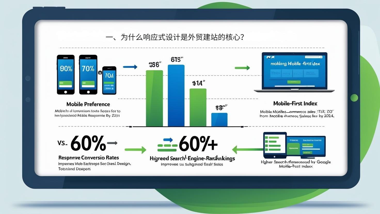
1. Why is responsive design the core of foreign trade website construction?
Responsive Design means that a website can automatically adjust its layout and content according to different devices (PC, tablet, mobile phone) to ensure a good user experience.
Changes in user habits : More than 70% of buyers worldwide prefer to search and access websites through mobile phones.
Search engine ranking : As early as 2018, Google clearly proposed the "mobile-first index", giving priority to websites that are well optimized for mobile devices.
Improved conversion rates : Websites with clear interfaces and smooth interactions make it easier for customers to complete inquiries and place orders.
According to Statista data, global mobile e-commerce sales will exceed 60% of total sales in 2024. This means that foreign trade websites that lack responsive design are almost doomed to fail to gain customer favor.
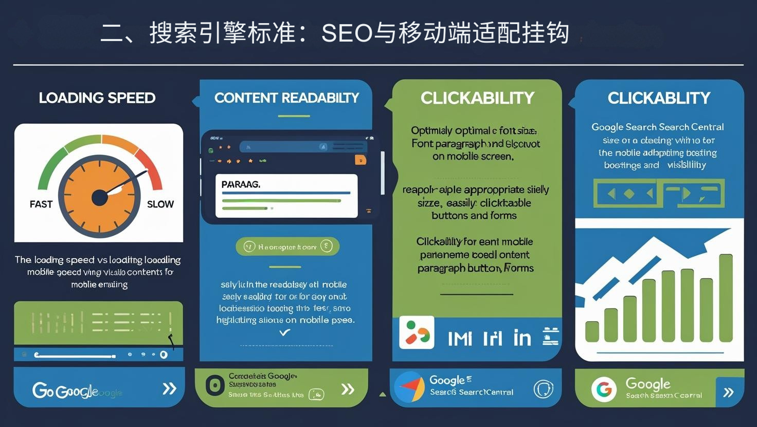
2. Search Engine Standards: SEO and Mobile Adaptation Linked
Responsive design is not only a user experience requirement, but also an important indicator for SEO optimization.
Loading speed : If a mobile page loads for more than 3 seconds, the bounce rate will increase by more than 50%.
Content readability : Font size and paragraph layout must be adapted to small screens.
Clickability : Buttons and forms should be easy to click with fingers to avoid accidental touches.
Google Search Central clearly states that a well-adapted mobile website will significantly increase its visibility in search engines. This is crucial for foreign trade companies that rely on organic traffic.
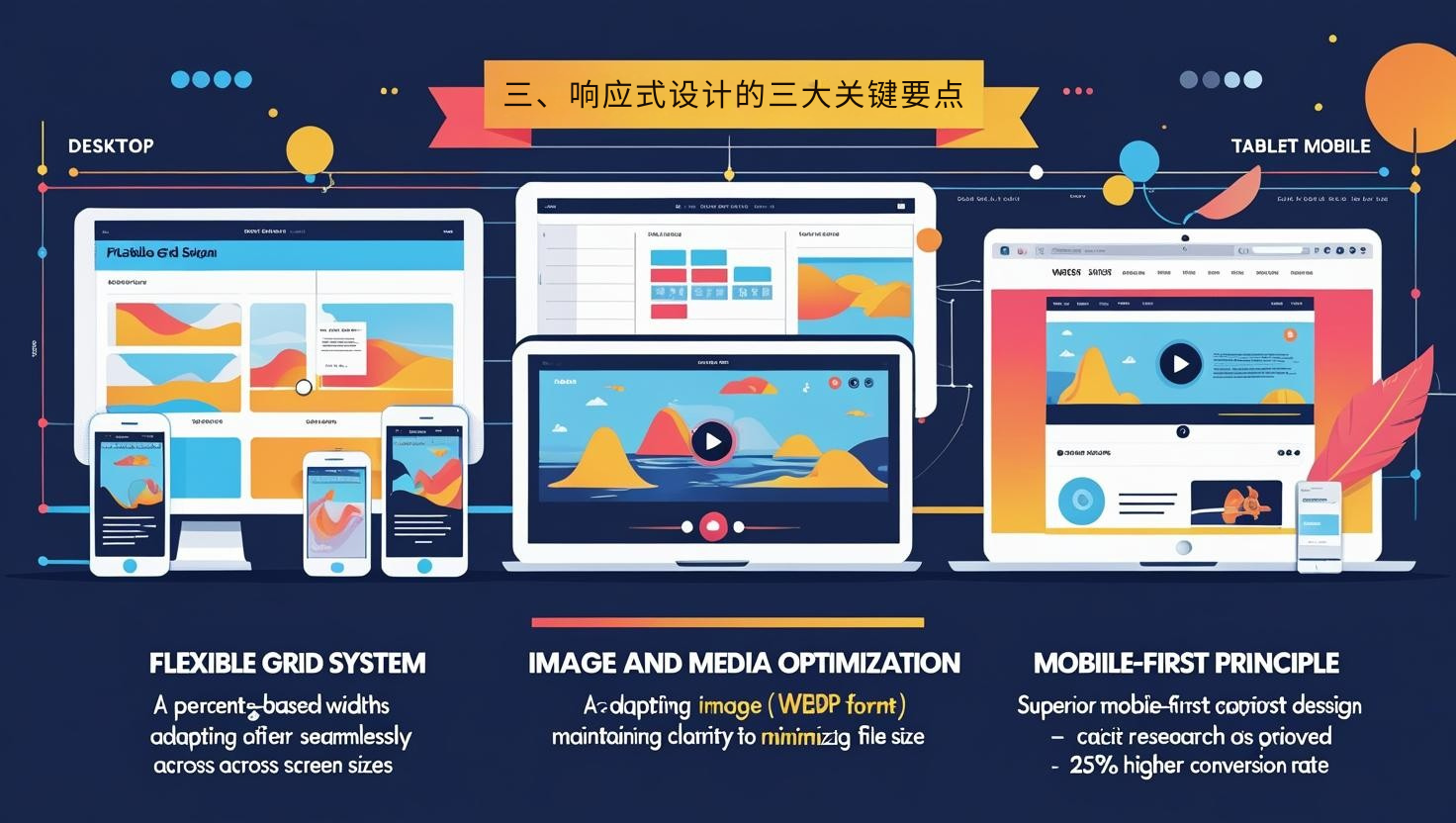
3. Three key points of responsive design
1. Flexible Grid System
Use percentage width and adaptive layout to allow the page to automatically scale on different screens.
2. Image and media optimization
Use adaptive images (such as WebP format) to reduce loading pressure while ensuring clarity.
The video must be playable across devices to avoid lag on mobile devices.
3. Mobile-first principle
In terms of design logic, we don’t make it PC first and then make it compatible with mobile phones, but rather give priority to the mobile experience.
According to research by the China Academy of Information and Communications Technology (CAICT) , corporate websites that adopt a mobile-first design have an average conversion rate 25% higher than traditional PC-first websites.
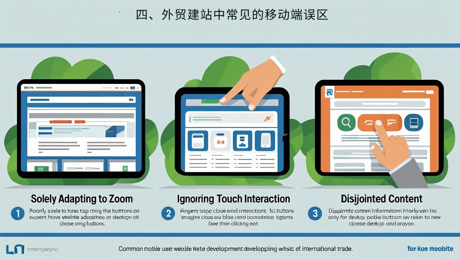
4. Common Misunderstandings of Mobile Terminals in Foreign Trade Website Construction
Only scaling adaptation is performed : simply shrinking the PC page to the mobile screen will result in too small fonts and poor user experience.
Ignoring touch interaction : Button spacing is not optimized, making user operation inconvenient.
Content fragmentation : The content on PC and mobile devices is inconsistent, which affects search engine inclusion and customer trust.
These misunderstandings not only damage the customer experience, but also affect SEO weight and directly lead to a decrease in organic traffic.
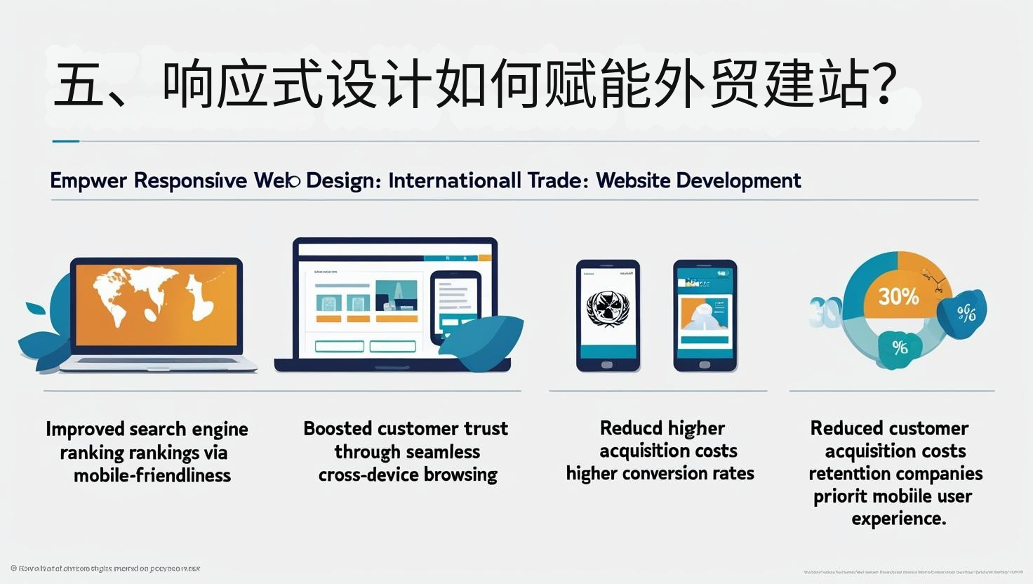
5. How does responsive design empower foreign trade website building?
Improve search rankings : Mobile-friendliness is an important ranking factor.
Enhance customer trust : Allow customers to browse smoothly on any device and improve professionalism.
Reduce customer acquisition costs : Better user experience leads to higher conversion rates and reduces advertising waste.
A report from the World Trade Organization (WTO) indicates that cross-border businesses that prioritize mobile user experience when building their websites for foreign trade see an average 30% higher online customer retention rate. This demonstrates that responsive design has become a core standard for foreign trade competition.
Recommended related articles: Foreign trade customer acquisition software + independent website: traffic conversion golden combination
6. Implementation suggestions from foreign trade bosses
Choose a website building system that supports responsive design : ensure automatic adaptation to PC and mobile devices.
Regular mobile testing : Use Google's mobile adaptation tool to check loading speed and interactive experience.
Continuously optimize content : Maintain concise and focused page logic on mobile devices.
As mobile traffic continues to rise, responsive design is no longer optional but a core standard for building international trade websites. Research from Statista , Google , and CAICT shows that the quality of the mobile user experience directly determines a website's ability to attract traffic and convert customers.
👉 If you're looking to quickly build a website for international trade that supports responsive design, SEO optimization, multilingual support, and automatic content updates , we recommend using the Pinshop platform . It helps business owners and international trade decision-makers achieve intelligent upgrades at a low cost, allowing global customers to easily access and complete orders on any device.