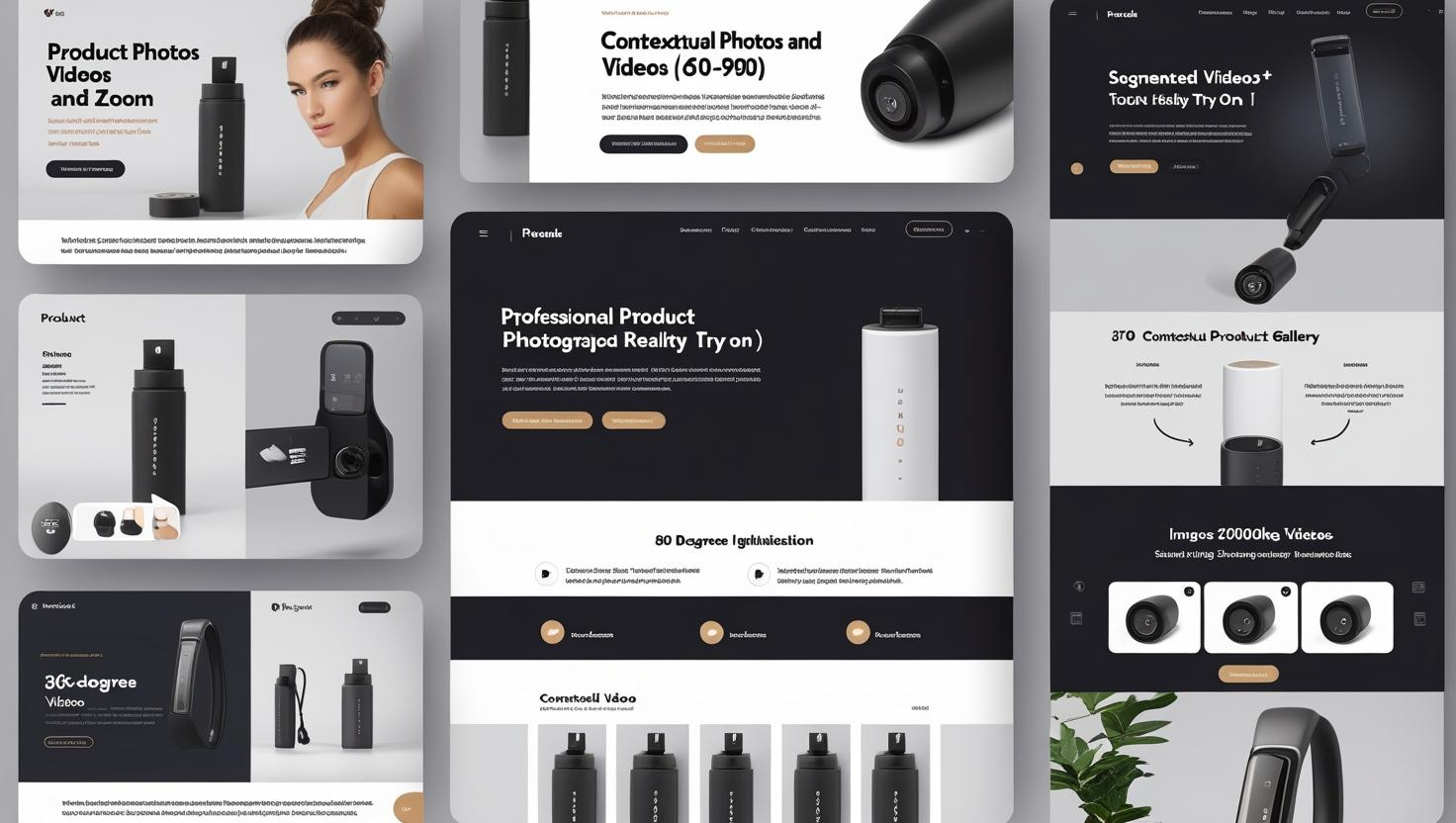
Visual Presentation: Make Your Product Pop on the Screen
Excellent product visuals are the first step to conversion:
-
Professional product photography strategy:
- Use multiple angles (at least 5-7 different perspectives)
- Implement zoom functionality to showcase product details (enable at least 2x magnification)
- Include photos of product use scenarios (enhance purchase inspiration)
- Ensure image loading speed (compress to 100-200KB without losing quality)
-
The power of video and 3D presentation:
- Add short videos showing product usage (60-90 seconds) seconds (ideally)
- Consider 360-degree rotations (to enhance product realism)
- Implement augmented reality try-on functionality (for furniture, glasses, etc.)
- Use segmented videos to highlight different product features
-
Mobile optimization tips:
- Implement vertical scrolling galleries instead of horizontal ones
- Ensure zooming supports touch gestures
- Prioritize loading the first image and progressively load other images
- Design a vertical video-first mobile experience
According to Shopify research, product pages that include videos have an average conversion rate increase of 80%, while pages with high-quality, multi-angle images have a 40% higher conversion rate than pages with a single image. Visual elements not only showcase the product but also reduce uncertainty and lower returns.
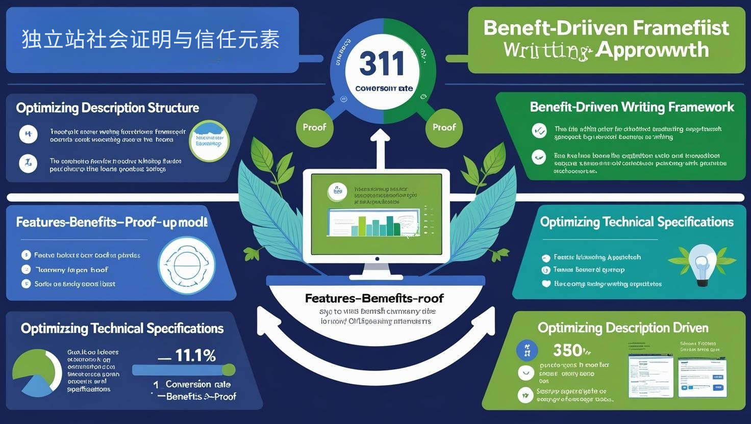
Product Descriptions: Shifting from Features to Benefits
Engaging product descriptions bridge information gaps:
-
Optimizing description structure:
- Open with a benefit-oriented summary (30-50 words)
- Use a scanner-friendly format (bullets, subheadings)
- Use a layered information architecture (important information first)
- Combining storytelling with technical specifications
-
Benefit-driven writing framework:
- Use the "Features-Benefits-Proof" model
- Address potential concerns and objections
- Customize content paragraphs for different buyer personas
- Use specific numbers and comparisons ("30% lighter" instead of "lighter")
-
Optimize technical specifications:
- Use comparison tables to present different options
- Visualize specifications (charts are better than numbers)
- Add context (explain the meaning of specifications)
- Offer downloadable detailed specifications for professional buyers
According to CXL's A/B testing research, pages that shifted product descriptions from a simple feature list to a "problem-solution" framework saw an average conversion rate increase of 31%. Remember, customers don't buy products; they buy the results they deliver.
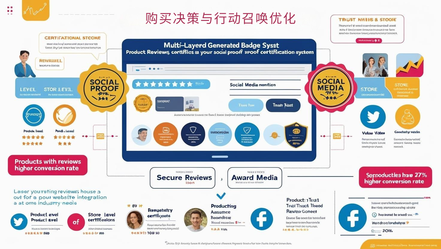
Social Proof and Trust Elements on Independent Websites
Reducing purchase risk is key to increasing conversion rates:
-
Optimizing review and rating systems:
- Implementing categorization filtering (by rating, date, and relevance)
- Encouraging reviews with pictures (increasing authenticity)
- Enabling Q&A functionality (addressing potential concerns)
- Highlighting the most helpful reviews
-
A multi-layered trust badge strategy:
- Product-level certifications (quality assurance, testing)
- Store-level trust seals (secure payment, privacy protection)
- Industry recognition (awards, media coverage)
- Expert endorsements and recommendations
-
User-generated content integration:
- Show product photos of actual users
- Integrate social media reviews and mentions
- Add video reviews and use cases
- Show real-time purchase notifications ("Someone just bought...")
A study by the Spiegel Research Center shows that products with reviews have a 270% higher conversion rate than those without, and when a product has five reviews, the likelihood of purchase increases fourfold. Trust isn't automatic; it must be intentionally built through multiple elements of proof.
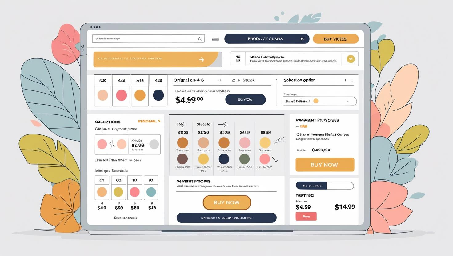
Purchase Decision and Call to Action Optimization
Simplifying the purchase process is key in the final step:
-
Call to Action (CTA) Design:
- Use high-contrast colors (visually distinct from other elements on the page)
- Use action-oriented copy ("Buy Now" is better than "Submit")
- Ensure the button is appropriately sized (minimum 44x44 pixels on mobile)
- Add subtle animation to increase engagement
-
Simplify purchase options:
Limit variant options (no more than 4-5 per category) - Use visual selectors (color, material, size)
- Implement smart defaults (most popular options)
- Add selection guides to aid decision-making
-
Display pricing and availability:
- Clearly display discount calculations (original price vs. savings)
- Implement scarcity cues (in-stock quantity, limited-time offers)
- Offer flexible payment options (installments, multiple payment methods)
- Prominently display shipping information and return policies
According to Baymard Institute research, 20% of shopping cart abandonment is due to a complex checkout process or insufficient information. Ensure a clear and seamless path to purchase, eliminating all potential friction points.
Product page optimization is a continuous process of testing and improvement, not a one-time project. Create an A/B testing plan to gradually test the impact of varying elements on conversion rates. Remember, the best product pages don't just showcase the product; they solve customer problems, build trust, and guide purchase decisions. By systematically optimizing the above elements, your product pages will become true conversion engines.