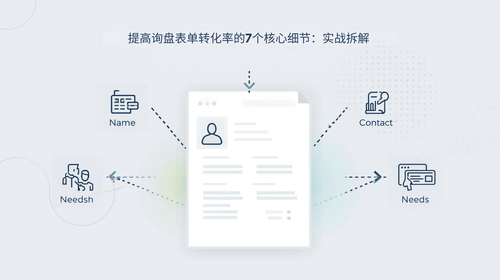
The inquiry form of an independent foreign trade website is the last critical step in converting traffic into customers. However, most companies lose a large amount of accurate traffic in vain due to improper form design: too many fields, hidden entrances, submission lags, missing prompts and other problems, resulting in buyer abandonment rates of over 70% midway through inquiries. As everyone knows, the conversion rate of the inquiry form is not determined by a single factor, but is affected by multiple details such as field design, entrance layout, interactive experience, trust endorsement, etc. Even optimizing a small detail can significantly improve the conversion rate.
Based on the actual operation experience of thousands of independent foreign trade websites, we have extracted the 7 core details of inquiry form design that can be directly implemented. From form fields, entrance layout, interactive experience to trust empowerment, we comprehensively dismantle the design logic of high-conversion forms. This method has helped a cross-border machinery brand increase the form submission rate from 12% to 58%, and the number of precise inquiries increased by 45%, allowing every traffic entering the independent station to be efficiently converted into effective inquiries.
Independent station inquiry form design: core pain points and optimization solutions
|
Challenge
|
Limitations of traditional forms
|
Optimization plan for high conversion form
|
|---|---|---|
|
Fields are too complicated
|
There are more than 8 fields in the form, and a lot of unnecessary information needs to be filled in, which makes the buyer exhausted
|
Minimalist field design, retaining only core necessary information and lowering the threshold for filling in
|
|
The entrance is hidden and difficult to find
|
Only place the form at the bottom of the page, no global traffic entrance, buyers can't find it
|
Multi-scenario layout entrance, homepage/product page/details page global reach, one-click arousal
|
|
Submit experience lag
|
Form loading delay, no feedback on the submit button, and submission failure when the network is poor
|
Form preloading + instant interactive feedback, adapted to overseas networks, zero lag in submission
|
|
Poor mobile adaptation
|
The form layout is messy, the input box is too small, and the mobile filling experience is extremely poor
|
Responsive and precise adaptation, mobile-specific optimization, adaptable to overseas mainstream devices
|
|
Trust endorsement missing
|
There is no privacy protection prompt, and buyers are worried about information leakage and dare not fill it out
|
Add privacy protection statement and corporate certification logo to eliminate information security concerns
|
|
Insufficient boot prompts
|
There is no filling guide, the required fields are unclear, and the buyer made mistakes in filling in and revised them repeatedly
|
Clear filling instructions + eye-catching markings on required items to reduce filling errors
|
|
Follow-up missing
|
There is no feedback after submission. The buyer is not sure whether the submission is successful and loses trust
|
Instant feedback on successful submission, with follow-up prompts to increase buyer expectations
|
|
Our core conclusions
|
Traditional forms only focus on "information collection" and ignore buyer experience and conversion logic
|
The high-conversion form takes "lowering the threshold, improving the experience, and building trust" as the core, allowing buyers to fill it out willingly and easily
|
|
Industry adaptation suggestions
|
B2B companies focus on professionalism and privacy protection, while B2C companies focus on simplicity and convenience, and detail optimization can be flexibly adjusted
|
|
|
Result: Conversion efficiency improved
|
After optimizing 7 details, the form submission rate increased by 40%+ on average, and the proportion of effective inquiries increased by 35%
|
|
|
Result: traffic value amplification
|
Let the previously lost accurate traffic be efficiently converted without additional investment, and the customer acquisition cost will be reduced by 50%
|
The core of the independent website inquiry form is not "collecting more information", but finding the best balance between "obtaining effective information" and "lowering the threshold for filling in". The design thinking of traditional forms is "enterprise-centered", while the design thinking of high-conversion forms is "buyer-centered", starting from every detail, making it easier and more secure for buyers to fill in.
Why trust this guide? Form optimization experience from actual combat
There are endless tutorials on independent website inquiry form design, but there are very few in-depth analyzes focusing on Practical detail optimization in foreign trade scenarios. Every design detail and every set of optimization data in this article comes from actual testing: we have optimized inquiry forms for thousands of foreign trade companies (covering categories such as machinery, electronics, home furnishings, beauty, auto parts, etc.). In these projects, any details that affect the buyer's filling experience and reduce conversion efficiency have been completely abandoned.
We have accumulated rich experience by solving practical problems, such as How to obtain the core effective information of foreign trade buyers in minimalist fields, or How to adapt to overseas networks to achieve smooth submission of forms. We combine the filling habits of overseas buyers, the inquiry needs of the foreign trade industry, and the technical adaptation rules of independent websites to transform practical skills into implementable design details to ensure that every optimization action can directly improve the form conversion rate.
We hope to share these practical experiences and help foreign trade companies avoid the form design misunderstanding of "emphasis on design over experience, emphasis on collection over conversion". Through the optimization of 7 core details, the inquiry form can become the "core gripper" for independent station traffic conversion, rather than a "traffic funnel".
7 core details to improve the conversion rate of inquiry forms: practical dismantling
The improvement in the conversion rate of the inquiry form is hidden in every overlooked detail. The following 7 core details have been verified in actual combat. They can be implemented directly without complex technical development to achieve a significant improvement in conversion rate. Each detail directly addresses the pain points of conversion:
Detail 1: Minimalist field design, retaining only core necessary information
The biggest pain point of traditional forms is the too many fields. Name, phone number, email, company, address, demand, quantity, budget and other information are all required to be filled in, causing buyers to give up midway. The core principle of a high-conversion form is **"minimalism necessary", and only retain the core fields that can meet the initial communication of foreign trade. B2B companies are recommended to keep only 4 fields: name, email/phone, country/region, and core requirements. B2C companies can simplify it to 3 fields: name, contact information, and requirements.
Practical data: After a cross-border electronics brand streamlined the form fields from 10 to 4, the form submission rate increased from 15% to 48%. Although the fields were reduced, the proportion of effective inquiries increased by 30%, because buyers are more willing to fill in real information and follow-up communication is more efficient.
Core Tips: Non-essential information can be supplemented through customer service follow-up after the buyer submits the inquiry. Do not increase the threshold for filling in the form.
Detail 2: Multi-scenario entrance layout to achieve global reach
Most companies only place inquiry forms at the bottom of the page, and buyers need to scroll to the bottom of the page to find them. A large amount of traffic is lost in the process. High-conversion forms require Multiple scene layout entrances so that buyers can quickly find the inquiry entrance on any page and at any browsing stage of the independent website.
Actual layout: ① Place the **"One-click Inquiry"** button on the top navigation bar of the entire site to evoke a floating form; ② Place the form entry in the core position of the home screen and details page of the product page to meet the inquiry needs of buyers after browsing the product; ③ A floating inquiry button is set on the right side of the page, which moves with the scroll bar and is always visible; ④ Place a form at the bottom of the article/blog page to attract precise traffic to the content.
Core Tips: The entry button uses high-saturation colors (such as orange, blue) to contrast with the page style to enhance visual recognition and allow buyers to see it at a glance.
Detail 3: Form preloading + instant interactive feedback to achieve zero lag in submission
When overseas buyers visit domestic independent websites, network delay problems are prominent. Traditional forms often have problems such as slow loading, lag in submission, and no feedback on clicks. Buyers get no response after clicking submit and choose to give up after repeated operations. High-conversion forms need to be technically adapted and optimized to ensure smooth loading and submission.
Practical Optimization: ① Use form preloading technology to load form components synchronously when the page is loaded to avoid delays caused by buyers clicking and then loading; ② Add Loading status feedback to the submit button, and "Submitting..." will be displayed after clicking, allowing buyers to perceive that the operation is effective; ③ Adapt to overseas networks, optimize the form submission interface, support submission in weak network environments, and avoid submission failures; ④ Add a submission failure prompt and provide a resubmit button to reduce losses caused by network problems.
Core Skills: Combined with the technical advantages of React standalone station, using virtual DOM and componentization features, the form interaction is smoother and the submission response speed is increased by 80%.
Detail 4: Mobile-specific optimization, adapted to overseas mainstream devices
Mobile traffic accounts for more than 60% of the independent foreign trade station. However, most forms have not been adapted to the mobile terminal. There are problems such as muddled layout, too small input boxes, and insensitive button clicks. The filling experience on the mobile terminal is extremely poor. High-converting forms must be mobile-specifically optimized to fit the mobile usage habits of overseas buyers.
Practical optimization: ① Responsive layout, the form width adapts to the mobile phone screen, no horizontal scrolling; ② Enlarge the input box and button size, the input box height is not less than 44px, and the button width accounts for ≥80%, improving the click experience; ③ Optimize the input keyboard adaptation, and automatically evoke the corresponding keyboard when filling in the phone/email, reducing buyer operations; ④ Cancel the horizontal sliding verification of the mobile form and switch to a simpler click verification to reduce the difficulty of operation.
Core Skills: Conduct real-device testing on mainstream overseas devices (such as Apple, Samsung, and Google Pixel) to ensure that the experience of the form is consistent on different devices.
Detail 5: Add trust endorsement to eliminate information security concerns
Overseas buyers attach great importance to the security of personal information. If the form does not have any privacy protection prompts, buyers will worry about information leakage and dare not fill in the form. High-converting forms need to add trust endorsement and privacy statement to make buyers feel more confident when filling out the form.
Practical Design: ① Add a Privacy Protection Statement at the bottom of the form, such as "We promise to strictly protect your personal information, only use it for business communication, and will never disclose it to third parties"; ② Place authoritative corporate certification logos next to the form, such as ISO, CE, SSL/HTTPS security certificates, overseas platform certifications, etc., to enhance corporate credibility; ③ Large foreign trade companies can add "data protection compliance" logos, such as GDPR compliance, to comply with overseas data protection requirements.
Core Skills: Trust endorsements and statements must be concise and clear, avoid lengthy text, and use the form of "icons + short sentences" to enhance visual perception.
Detail 6: Clear guidance prompts to reduce filling errors
Traditional forms often have problems such as ambiguous required fields and no guidance on the filling format. Buyers fail to submit due to filling errors and lose patience after repeated modifications. High-converting forms need to add clear guidance prompts to allow buyers to fill it out successfully the first time.
Practical design: ① Add a eye-catching red "*" mark before the required fields to distinguish them from non-required fields so that buyers can identify them at a glance; ② Add filling format guidelines in the input box, such as the email box marked "Example: xxx@xxx.com", and the phone box is marked "Example: +86 138xxxx1234", which fits the contact format of overseas buyers; ③ Add a short filling guide at the top of the form, such as "Fill in the following information, and we will communicate with you professionally within 24 hours" to guide buyers to fill in.
Core Tips: Fill in the prompts using small light gray characters, placed inside or on the right side of the input box, which does not affect the beauty of the page and can also serve as a guide.
Detail 7: Immediate feedback on successful submission, clarify the time limit for follow-up
Most forms only display "Submission Successful" after submission without any follow-up prompts. Buyers are not sure whether the information has been truly submitted and do not know when the company will contact them, resulting in a reduced willingness to communicate in the follow-up and even thinking that it is a fake form. High-conversion forms require refined feedback on successful submission to enhance buyers' trust and expectations.
Practical design: ① After successful submission, Personalized thank you + visual success icon will be displayed, such as "Thank you for your inquiry, our foreign trade consultant has received your information!"; ② Clarify the time limit for follow-up, such as "We will communicate with you professionally via email/phone within 24 hours, please keep your contact information open"; ③ You can add value-added guidance, such as "You can add our WhatsApp: XXX, instant communication is more efficient", and provide multi-channel follow-up methods.
Core Tips: The feedback page can add company popular product recommendations, allowing buyers to continue browsing products while waiting for follow-up, increasing the time spent on the site.
How to achieve the best balance of experience, conversion and information effectiveness through form design?
Different foreign trade companies have different category characteristics (B2B/B2C), target buyers (professional buyers/ordinary consumers), and business needs. The design details of the inquiry form also need to be adapted to local conditions. The following decision-making framework helps you flexibly optimize 7 core details according to your own situation to achieve the best balance of experience, conversion and information effectiveness:
|
Enterprise type/requirement
|
Focus on form design optimization
|
Basic principles and key trade-offs
|
|---|---|---|
|
B2B standard product enterprise (machinery/electronics)
|
Minimalist fields + corporate certification endorsement + overseas compliance statement
|
Professional buyers pay more attention to information security and corporate credibility, minimalist fields increase submission rates, endorsements enhance trust, and ensure effective inquiries
|
|
B2B non-standard product enterprise (customized home/auto parts)
|
Core fields + demand description box + mobile adaptation
|
Customized business requires a preliminary understanding of buyer needs, retaining a brief demand box, and mobile terminal adaptation to capture fragmented traffic
|
|
B2C FMCG enterprise (beauty/daily necessities)
|
Super simple field + one-click submission + floating entrance
|
C-side consumers focus on convenience, ultra-simplified fields + one-click submission lower the threshold, and the floating entrance achieves global reach
|
|
B2C consumer-resistant enterprise (furniture/home appliances)
|
Streamlined fields + after-sales protection tips + multi-channel follow-up
|
Consumable goods buyers pay more attention to follow-up services, add after-sales guarantee tips to enhance trust, and follow up through multiple channels to ensure communication efficiency
|
|
General optimization path (small and medium-sized foreign trade enterprises)
|
4 core fields + multi-scenario entrance + submission feedback + privacy statement
|
Balancing conversion and information effectiveness, no complicated design is required, and the conversion rate can be greatly improved by directly implementing it
|
The core of form design is **"Adapt to local conditions"**. Don't copy it mechanically. It needs to be flexibly adjusted based on the 7 core details based on your own business needs. You can neither sacrifice information effectiveness for conversion nor sacrifice conversion efficiency for collecting information.
Practical case: cross-border machinery brand inquiry form optimization, conversion rate increased by 467%
A cross-border machinery brand's original independent website inquiry form fell into the dilemma of "there is traffic but no inquiry" due to improper design: the form has 10 fields, only the entrance is placed at the bottom of the page, the mobile terminal layout is disordered, there is no feedback after submission, the form submission rate is only 12%, and the average monthly accurate inquiry volume is less than 10. In 2024, we will optimize 7 core details for its implementation to achieve all-round breakthroughs in conversion efficiency.
Customer Challenge
-
The form fields include 8 items: name, phone number, email, company name, address, product requirements, purchase quantity, and budget. The buyer took more than 5 minutes to fill in, and the abandonment rate reached 85%;
-
Only place the form entry at the bottom of the page. Buyers have to scroll to the bottom to find it. 60% of the traffic is lost during the scrolling process;
-
The form is delayed in loading. Overseas buyers have to wait more than 3 seconds to load after clicking. The submit button has no feedback and cannot be submitted after multiple clicks;
-
The layout of the mobile form is messy, the input box is too small, and it is easy to accidentally click when clicking. The mobile submission rate is only 5%;
-
There is no privacy statement or corporate certification mark. Buyers are afraid of information leakage and dare not fill in real information;
-
The required fields are not marked, and there is no guidance on the filling format. The buyer failed to submit due to format errors and gave up after repeated modifications;
-
After submission, only "Submission Successful" is displayed, and there is no follow-up prompt. The buyer is not sure whether he will be contacted, and has low willingness to communicate in the future.
Our solution
-
Minimalist field optimization: Streamline the 8 fields into 4 core fields: Name, phone/email, country/region, and core requirements. Non-essential information will be supplemented through follow-up customer service follow-up;
-
Multiple scene entrance layout: Add a "one-click inquiry" floating button at the top of the entire site, place the form entrance at the core of the home screen and detail page of the product page, and set a follow-up floating inquiry button on the right side of the page;
-
Technical adaptation optimization: Adopt React form preloading technology to realize instant recall of forms, add submission loading status and failed resubmission functions, and adapt to overseas weak network environments;
-
Exclusive optimization for mobile terminals: The responsive layout adapts to all mobile phone screens, enlarges the size of input boxes and buttons, automatically evokes the corresponding input keyboard, and cancels complex verification;
-
Add trust endorsement: Add a privacy protection statement at the bottom of the form, and place ISO, CE certification and SSL security certificate icons next to it to meet the information security needs of overseas buyers;
-
Guide prompt design: Add a red "*" mark before required items, add filling format guidelines in the input box, and add a short filling prompt at the top of the form;
-
Submission feedback optimization: After successful submission, a visual success icon + thank you message will be displayed, "24-hour professional follow-up by domestic and foreign trade consultants" will be clarified, and a WhatsApp instant communication channel will be added.
Results and values
-
Conversion efficiency: the form submission rate increased from 12% to 58%, the conversion rate increased by 467%, and the average monthly number of precise inquiries increased from 8 to 38, an increase of 375%;
-
Traffic value: The accurate traffic that was originally lost is efficiently converted without additional investment costs, and the customer acquisition cost is reduced by 52%;
-
Communication efficiency: Although the fields are streamlined, the information filled in by buyers is more authentic, the proportion of effective inquiries increases from 60% to 95%, and the follow-up efficiency of follow-up customer service increases by 80%;
-
Mobile terminal conversion: The mobile terminal submission rate increased from 5% to 55%, capturing 60% of mobile terminal traffic and becoming the core source of inquiries.
This case fully proves that the conversion rate of independent website inquiry forms can be improved without complex technology and design. It only needs to start from the buyer's experience and optimize every overlooked detail. The implementation of 7 core details turns the original "traffic funnel" into a "conversion grabber" to maximize the value of traffic.
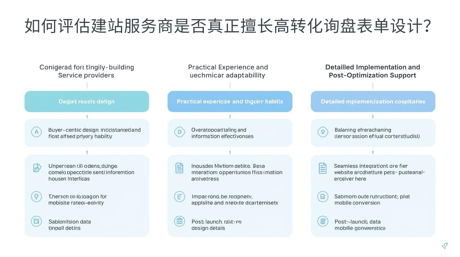
How to evaluate whether a website building service provider is really good at high-conversion inquiry form design?
The core of choosing an independent website building service provider is not only whether it can build a beautiful website, but also whether it can design an inquiry form that is suitable for foreign trade scenarios and has high conversion. The following three dimensions help you make wise decisions and avoid traffic loss caused by improper form design:
Adaptability of design logic to buyer needs
-
Can you clearly dismantle the "buyer-centered" form design logic instead of simply pursuing the aesthetics of the form?
-
Do you understand the filling habits and information security needs of overseas buyers (B2B/B2C), and can you design form fields and trust endorsements accordingly?
-
Is it possible to balance "field simplification" and "information effectiveness" based on the characteristics of the foreign trade industry to avoid over-simplification that leads to unfounded follow-up communications?
Practical experience and technical adaptability
-
Are there any form optimization cases in the same industry that can provide specific quantitative data (such as submission rate improvement ratio, inquiry volume growth data)?
-
Can we implement technical adaptation and optimization of the form, such as preloading, overseas network adaptation, and mobile terminal precise optimization, to ensure zero lag in submission?
-
Can be combined with the technical architecture of an independent website (such as React) to achieve seamless integration of forms and websites to enhance the interactive experience?
Detailed implementation and post-optimization support
-
Can implement 7 core design details, instead of just providing templated forms, and support flexible adjustment of fields and layout according to enterprise needs?
-
After the website is built, will form data monitoring be provided, such as submission rate, abandonment rate, and mobile conversion data, to help companies find problems?
-
Can you provide post-optimization suggestions based on form data feedback to continuously improve the form conversion rate?
We always adhere to the form design concept of "conversion as the core, buyer experience as the guide". Through the implementation and flexible optimization of 7 core details, we help foreign trade companies efficiently convert traffic into effective inquiries, making the inquiry form the core focus of independent websites to acquire customers.

Why is it recommended to choose the same service provider from form design to post-optimization?
独立站询盘表单设计后切换服务商,容易面临**“设计逻辑断层、技术适配不畅、数据监测缺失”**的风险,导致表单转化率无法持续提升。选择同一服务商,可实现表单设计与独立站运营的无缝衔接,确保转化效果的长期稳定:
保留核心设计逻辑与数据资产
服务商熟悉你的表单设计逻辑、海外目标买家需求、表单数据表现,后期优化时无需重新熟悉,可直接根据数据反馈(如放弃率、提交率)进行针对性优化,避免设计逻辑断层,确保转化效果的连续性。
确保表单与独立站技术架构协同
询盘表单的流畅性与独立站的技术架构深度相关,同一服务商可根据独立站的技术架构(如React),持续优化表单的技术适配,如预加载、交互反馈、海外网络适配,确保表单与网站的无缝融合,提升交互体验。
降低沟通与时间成本
无需重新向新服务商解释企业的业务需求、目标买家、表单设计要求,后期优化的沟通效率更高,时间成本更低,让企业专注于客户跟进与市场拓展,无需在表单优化上耗费过多精力。
我们提供**“询盘表单设计-技术适配-数据监测-后期优化”**一站式服务,后期可根据企业的业务增长与买家需求变化,灵活调整表单设计细节,持续提升表单转化率,让独立站的流量价值最大化。
常见问题解答
-
表单字段越精简越好吗?是否会影响后续沟通效率?
并非越精简越好,核心是**“保留必要信息,舍弃非必要信息”**。外贸企业需保留能满足初步商务沟通的核心字段(如联系方式、核心需求、国家/地区),非必要信息可通过客服跟进补充。实战证明,极简字段下买家填写的信息更真实,有效询盘占比更高,后续沟通效率反而提升。
-
B2B与B2C企业的询盘表单设计,核心细节有何差异?
核心差异在于买家需求与填写习惯:① B2B企业需注重专业度与信任背书,添加企业认证、隐私合规声明,字段可保留4个核心项,满足专业采购商的沟通需求;② B2C企业需注重便捷性与高效性,字段可精简至3个,添加一键提交、悬浮入口,贴合C端消费者的碎片化填写习惯。
-
海外不同市场的询盘表单,是否需要做本地化优化?
需要。不同海外市场的买家对信息安全、联系方式格式的要求不同,如欧美市场注重GDPR合规,东南亚市场更常用WhatsApp沟通,中东市场需注重阿拉伯语适配。可针对核心市场,优化隐私声明、联系方式指引、表单语言,提升本地化体验。
-
React独立站的询盘表单,有哪些专属的技术优化优势?
React独立站的组件化、虚拟DOM特性,让表单拥有更流畅的交互体验:① 可实现表单组件预加载,即时唤起无延迟;② 虚拟DOM让表单交互更顺滑,提交按钮反馈更及时;③ 组件化设计让表单可灵活嵌入独立站的任何页面,多场景布局更便捷;④ 可结合React的状态管理,实现表单填写数据的临时保存,避免买家因误操作导致填写内容丢失。
-
表单提交后,如何提升买家的后续沟通意愿?
核心是**“即时反馈+明确跟进时效+多渠道沟通”**:① 提交成功后给出清晰的可视化反馈,让买家确认提交有效;② 明确企业的跟进时效(如24小时内),让买家有期待;③ 提供多渠道沟通方式(如WhatsApp、邮箱、电话),让买家可选择自己便捷的方式进行即时沟通。
-
如何监测询盘表单的转化数据,找到优化方向?
可通过独立站的智能仪表盘监测核心数据:① 表单提交率:衡量整体转化效率;② 中途放弃率:找到买家放弃的关键环节;③ 移动端/PC端转化比:判断是否需要优化移动端体验;④ 字段填写错误率:判断引导提示是否清晰。根据数据反馈,针对性优化对应的设计细节。
-
中小外贸企业预算有限,能否低成本落地7个核心细节?
可以。 7个核心细节的落地,无需复杂的技术开发与高额的设计成本:① 极简字段、引导提示、隐私声明可直接在表单后台设置;② 多场景入口布局可通过建站后台添加悬浮按钮与表单入口;③ 移动端适配可通过响应式设计实现,无需单独开发;④ 提交反馈可通过简单的文字与图标设置。所有细节均可低成本快速落地,实现转化率的显着提升。
Recommended related articles: Your peers have not yet reacted: using GEO to build an independent foreign trade station is the biggest blue ocean strategy at the moment
Recommended related articles: Your peers have not yet reacted: using GEO to build an independent foreign trade station is the biggest blue ocean strategy at the moment
独立站询盘表单是流量转化为有效询盘的最后一道关键关口,其转化率并非由单一因素决定,而是藏在极简字段、多场景入口、流畅交互、信任背书等7个核心细节里。传统表单以“企业为中心”,注重信息收集,却忽视了买家体验,导致大量流量流失;而高转化表单以“买家为中心”,通过7个核心细节的优化,实现“降低填写门槛、提升交互体验、建立信息信任”的核心目标,让买家愿意填、轻松填、放心填。
我们提炼的7个核心细节,均经过数千家外贸独立站实战验证,无需复杂的技术开发,低成本快速落地,即可实现表单提交率平均提升40%+,有效询盘量增长35%+,让每一个进入独立站的流量都能高效转化为有效询盘。
如果你的独立站正面临询盘表单提交率低、流量流失严重的问题,建议立即落地这7个核心细节,或联系我们进行专业的表单优化。我们将在4小时内免费为您提供《独立站询盘表单诊断及优化方案》,帮助您找到表单设计的问题所在,通过细节优化实现转化率的大幅提升,让询盘表单成为独立站获客的核心抓手。